Neto Scariot
Product & UX/UI Designer
Improving revenue performance for a logistics company by optimizing paid media experiences through website and app redesign.
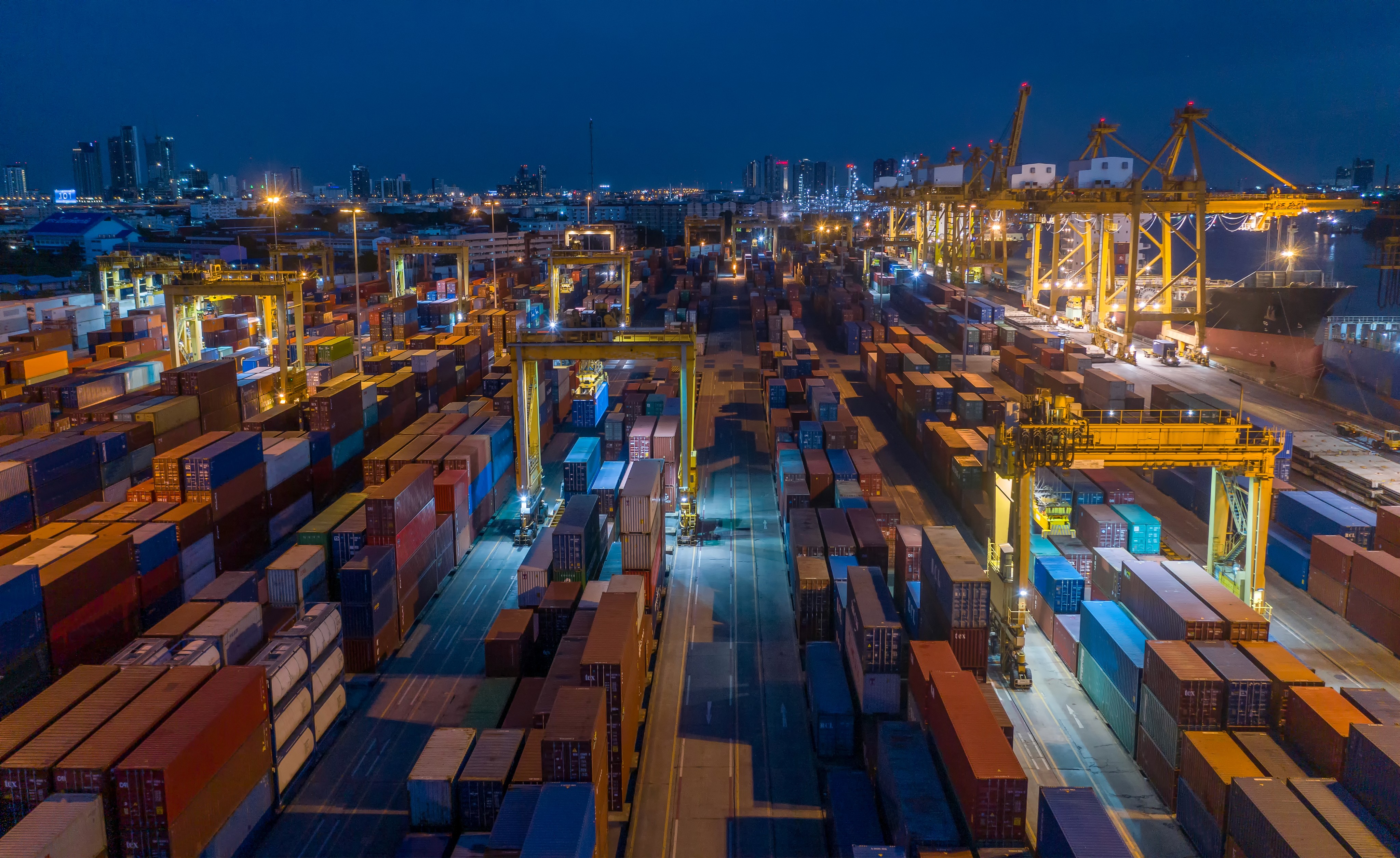
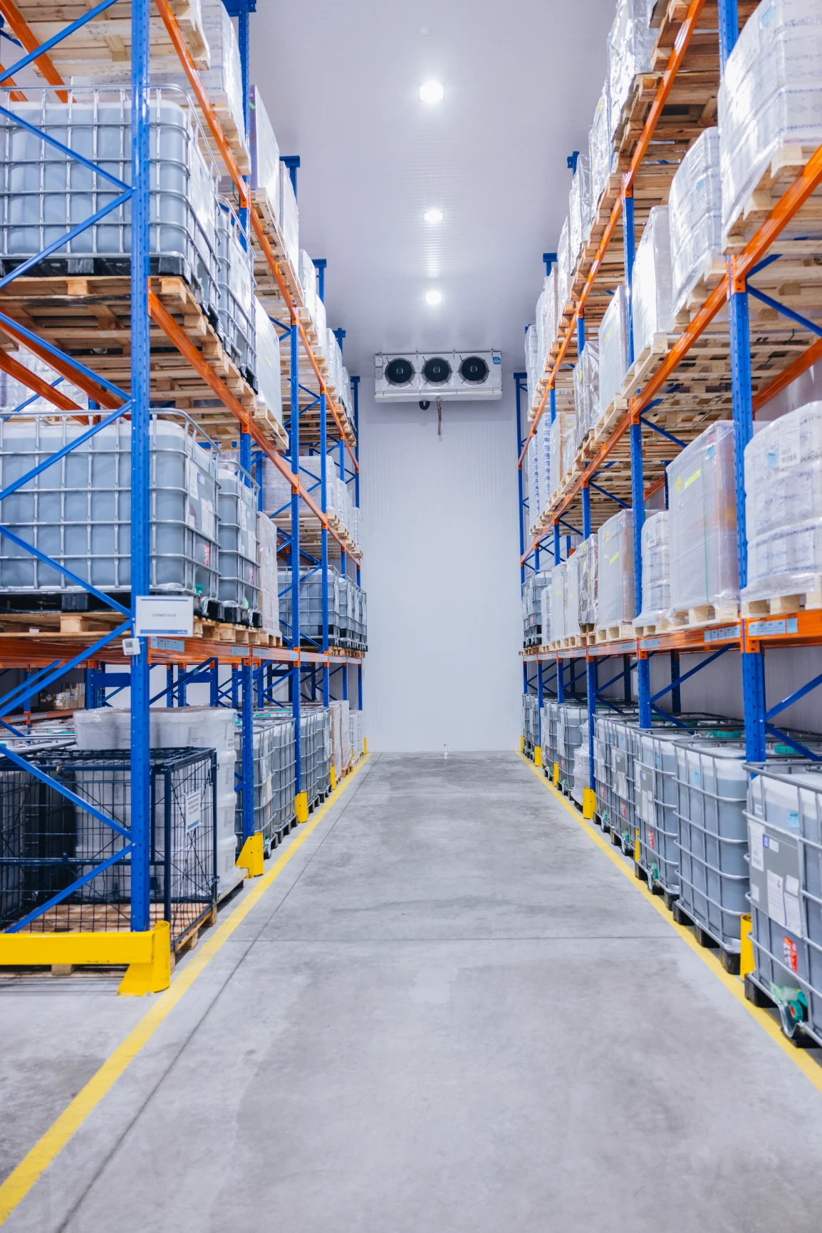
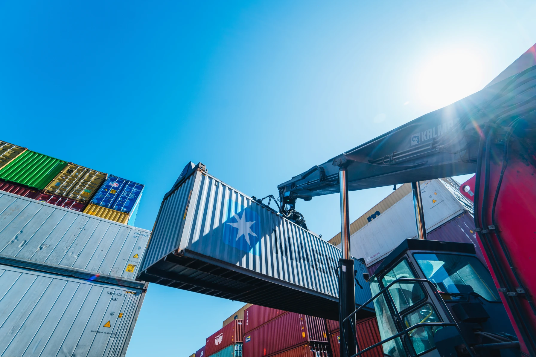
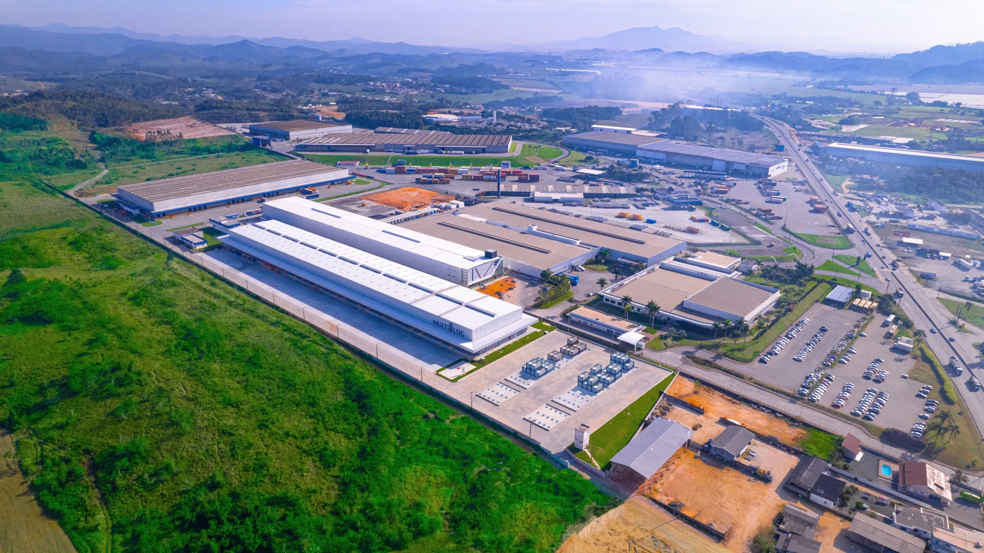
Multilog is one of the leaders in logistics in Latin America, with strategic warehouses and specialized fleets that move the main sectors of the continent, from imported cars to delicate chemical materials.
The investment in ads is massive, but we have no results.
83% of users directed to our website remain less than 60 seconds.
This reveals a serious problem about money loss, besides wasting the value of 5 digits invested in ads; the negative website experience damages the company's image and reliability, making us lose business and potential clients.
Furthermore, Multilog has an application called Genius, which brings real-time information about the logistics of cargo for clients and agents. This application currently has low usability, despite being a tool of high competitive potential, seeing that our competitors do not possess this technology in the logistics market.
POSITION
Product Design Lead
INDUSTRY
Logistics
B2B
Class A-B
MARKET
Multilog operates in Latin America, serving over 10,000 clients with revenue exceeding
USD 500 millions.
TOOLS
Figma
Miro
Google Analytics
Hot Jar
Adobe After Effects
Adobe Premiere
Dovetail
v0 AI
Marvel
TestFairy
GPT-4
Midjourney
Spline 3D
Salesforce
RESPONSABILITY
Lead the entire design process, from research to hand-off.
Conduct user interviews, manage and validate design decisions with stakeholders.
Create wireframes, high-fidelity prototypes, and a functional, responsive and comprehensive design system.
Collaborate with developers to ensure the design is implemented correctly.
Conduct usability tests and iterate based on feedback.
We invest five-digits monthly in ads that direct traffic to the website.
83% of visitors leave in less than 60 seconds.
This means we are losing business opportunities; the money invested in ads is being wasted, and the negative experience is also damaging the company's image and reliability.
83%
HIGH BOUNCE RATE
83% of visitors left in less than 60 seconds, indicating they did not engage with the content or services.
>3%
LOW LEAD CONVERSION
Less than 3% of users visiting the site contact us and become leads.
Only 0.04% of leads are qualified.
<99.8%
MISSED REVENUE OPPORTUNITIES
Failure to effectively present Multilog's logistics solutions, resulting in
99.8% of unsucessful web traffic.
74
POOR MOBILE RESPONSIVENESS
74% of visitors used mobile devices, but the site was slow and difficult to use on smaller screens.
Redesign the entire user experience and its interfaces through a consistent design system that unifies both the website and Genius, our logistics app.
This initiative enhances business scalability, ensures qualified lead generation, and addresses ongoing financial losses.
After redefining our digital experience, leads are now directed to pages tailored to the specific services they seek.
We deployed and A/B tested four segmented experiences of our new website: Health Hub, Distribution Center, Chemical Warehouse, and Special Transports.
-55%
BOUNCE RATE REDUCED
We reduced the number of users leaving the website in less than 60 seconds from 83% to 28%.
+4x
MUCH MORE LEADS
We increased lead capture from 3% to 12%, with 4 times more users filling out the contact form.
18%
MORE QUALIFIED LEADS
Qualified sales leads increased dramatically, rising from 0.04% to 18%.
1.4s
SEO AND LOAD-TIME OPTIMIZED
Loading time decreased from 5.2s to 1.4s, enhancing website performance and ranking.
TIME
3 months to complete the redesign.
BUDGET
Limited resources for usability testing and developers.
technical
The final delivery must align with Genius, our logistics app, and integrate seamlessly with Multilog's existing systems for freight quotes and tracking within Salesforce.
After analyzing our data, we collected some
bad metrics that clearly explain the lack of results of our ads and digital experiences.
Click to read more about Multilog
SESSION DURATION
Visitors spent an average of 47 seconds on the site.
PAGE VIEWS
Only 8% of visitors viewed more than one page.
LOAD TIME
The site took an average of 5.2 seconds to load, and 7 seconds on mobile.
NAVIGATION ISSUES
Key services were buried in the navigation. 04+ clicks to access.
CALL TO ACTION
The calls-to-action were unclear and didn’t stand out.
BOUNCE RATE
83% of visitors left within 60 seconds.
We initiated the research phase by visiting the main units of Multilog, analyzing internal data, comparing competitor strategies, mapping key journeys, and interviewing stakeholders
BENCHMARKING
Reviewed a total of 80 companies (50 domestic, 30 international), consisting of 27 within the logistics market and 53 in related sectors.
STAKEHOLDER DYNAMICS
Prioritization dynamics led us to understand the main points of the journey from the stakeholders' perspective. Using card-sorting techniques, we defined the prioritization matrix by listing the tasks that represent the greatest impact on business objectives and results.
DATA ANALYSIS
We utilized metrics from Salesforce and campaigns from Google and Meta Ads, combining artificial intelligence tools like Snowflake, BigQuery, TestFairy, and Hotjar to collect and analyze internal data and that of our competitors.
The prototypes and heatmaps generated by v0 were the basis for defining the strategy for new campaigns and optimizing the information architecture.
USER INTERVIEWS
We interviewed 9 users and 4 potential clients from the logistics market, gathering insights and the main pain points based on the experiences of our competitors and our current website.
Later in the ideation phase, a small group of these users also participated in the iteration process on the high-fidelity prototypes.
Pain Points
User can't find what they need
To obtain the necessary information from a specific service, users had to perform more than 04 actions, yet they were still directed to an incomplete page.
CLUTTERED LAYOUT AND INFORMATION
The lack of a design system results in a cluttered layout that is not aligned with Multilog's brand guidelines, delivering a poor experience that negatively impacts the company's positioning and scalability.
PERFORMANCE ISSUES
Users perceive our website as an untrustworthy, outdated experience, with unoptimized digital elements that struggle to load, poor interactions, and counterintuitive navigation.
LACK OF TRUST
74% of users affirm that they would not close a deal with Multilog after researching our company through the current website.
Opportunities
INFORMATION ARCHITECTURE
A new information architecture with a structured sitemap will optimize usability, ensuring that tasks are completed in less time.
This way, users get what they want quickly and intuitively, and we iterate on solutions more efficiently.
DESIGN SYSTEM
Developing a consistent and comprehensive design system that can also support our logistics app will resolve our main design and interface issues, ensuring product scalability.
We are using Atomic Design to later absorb and optimize components within the system.
LOTTIEFILES AND MICRO-INTERACTIONS
Performance and SEO issues will be optimized for hand-off, using dev-friendly elements and microinteractions in Lottiefiles, bringing life to the interface in a light and dynamic way.
The integration of the ScrollReveal JavaScript library provides motion to elements without overwhelming the user with our excess information.
MAP, chatbot, big data AND VIDEO CONTENT
Multilog's impressive numbers appear animated near the first fold.
Our video collection showcases the company's dimensions, including warehouses, special fleets, and border operations.
The units are visualized with an interactive map displaying key information.
Support appears in a chatbot fixed to the navigation, while interactive components compress and highlight important elements like feedbacks and the company's timeline.
Based on the prioritization matrix defined in the dynamics with stakeholders, and the insights obtained through data tools, we selected some journeys to map and restructure on our website.
SOLVED WITH MULTI-STEP FORMS
Requesting a cargo quote


SOLVED WITH AR MAP COMPONENT
Viewing Multilog's units
SOLVED WITH INTERACTIVE ACCESSIBILITY
STEP #01
homepage
STEP #02
CONTACT
step #03
EXTENSIVE form
STEP #04
NO CONFIRMATION
User enters the homepage and searches for pricing.
Accesses the contact page to request a quote.
Falls into an extensive form and fills it out partially.
Does not receive any confirmation automation.
Contacting support and the sales team
Fernando Augusto
Cargo Manager
CONTEXT
Works at a logistics company that handles the entire process for various clients and industries.
EMPATHIZE
Prioritizes fast deadlines, reduced costs, and a straightforward foreign trade process.
Patrícia Almeida
Business Owner
CONTEXT
Owns a company that imports international products from specific segments and resells them to the end customer.
EMPATHIZE
Seeks services according to the cargo, aiming for a personalized logistics operation.
José Alencar
Investor
CONTEXT
Partial owner or associate of the main clients and stakeholders that feeds Multilog.
EMPATHIZE
Builds loyalty through market differentiators that directly impact revenue.
Mariana Gil
Logistics Consultant
CONTEXT
Provides legal advice on cargo movement for clients with logistical needs.
EMPATHIZE
Desires a simplified and real-time view of the logistics process.
Business-oriented approach:
Clarifying actions and defining priorities
unique value proposition
Simplify complex logistical processes for high-value industries by offering customized solutions through a fast and objective digital experience.
UNFAIR ADVANTAGE
Promote our 360° logistics management with the Genius app and its integration with SISCOMEX. 87% of competitors do not have this technology.
key metrics
Identify critical revenue KPIs such as Cost per Lead, Quote to Close Rate, and losses due to customs delays.
Segment campaigns with high-value industries to maximize profitability. These metrics should guide our design decisions, serving as a basis for solving money loss issues.
agile and LEAN DESIGN
Define the most impactful features to design, using execution cost analysis and feasibility scorecards.
Co-creation workshops and meetings with stakeholders to ensure alignment, revealing important business points that imply reducing rework and correcting strategies even before creating wireframes.
Based on our KPIs, we defined some important directions using HMW questions and assumptions.
HOW MIGHT WE
reduce bounce rate?
The website's bounce rate is rooted in the first section of the website. We prototyped 04 hero options and validated them with stakeholders and clients before developing the entire homepage.
HOW MIGHT WE
INCREASE AND QUALIFY LEADS?
Our personas have different pains and desires, respectively related to our key services. We structured specific pages for each service/persona with step-by-step quote forms. We collaborated with the growth team to define the best questions for each type of lead.
HOW MIGHT WE
display our unfair advantage?
The biggest challenge is demonstrating our app's function in a short period of time for users to understand how this advantage works. We created a wildcard component that showcases the app interface in motion, validating its functionality in action.
HOW MIGHT WE
INCREASE AWARENESS OF OUR SERVICES?
We enhanced the service cards and reduced the journey to two steps, directing users straight to the service page related to the card, integrating all necessary information. These pages are targets of our campaigns.
Solved our information overload problem by creating a sitemap with a simplified flow and condensing less important pages into an interactive menu.
We reduced the number of actions to request quotes, contact us, view units, and explore services.
-4x
TASK EXECUTION TIME
We created a rule of a maximum of 03 actions for the main journeys.
Through new flows and optimized components, we reduced action time by more than 04 times.
-24
NUMBER OF PAGES ON THE SITE
We eliminated 24 unnecessary pages from the website.
We optimized the menu to keep this information in our experience without overwhelming the user with an extensive sitemap.
We designed four options for the hero section.
Upon stakeholder review and selection,
we proceeded to create a comprehensive homepage wireframe.
Following three rounds of revisions, we successfully defined the page structure
and functionality of the core components.
Following the branding guidelines of Multilog, we created a new design system, keeping in mind that part of it would also serve Genius, our logistics app.
The goal is for it to be simple and accessible, to ensure evangelization within the internal product, development, and marketing sectors, which will continuously use this new system.
We deployed a web app with all Foundations, Figma/Code Tokens, Brand Guidelines,
and Components, ready for use.
Users
DEVELOPERS
Structured guidelines with their respective tokens, code-ready components for easy integration, and foundation elements like effects, padding, and icons, are copied as code or SVG with just one click.
ZERO-HEIGHT AND DOCUMENTATION
The design system is also fully integrated with Figma, and has all its elements translated into tokens and variables that are displayed on the website, along with a usage guide that instructs the best practices for layout and composition.
marketing partners
To boost lead generation, we extended the design system to campaigns. Adobe libraries standardized advertising foundations, improving asset consistency and efficiency while elevating brand perception
THIRD-PARTY USERS
Our extensive chain of partners needed a reference to obtain the brand attributes to create their actions, events, and graphic pieces, without violating Multilog's guidelines. The online system allowed quick access to the design guidelines for those involved.
Composition
BRAND GUIDELINES
Multilog's branding and visual identity standards became Figma Tokens and copyable code, displayed in various sections ranging from typography to shadow effects.
UI LIBRARY
The resource library enhances the interface with cards, buttons, forms, and navigation features. Complex components like maps for cargo tracking and logistics dashboards are optimized and ready for use.
UX WRITING
The typographic hierarchy was organized into variables that have respective guidelines for each headline and body-tag created. Writing standards are being defined by the copywriting team to integrate with the system's tone of voice.
SYSTEM DOCUMENTATION
In addition to the system application being online on the web, we also created a PDF documentation that explains the importance and the decision rationale for each design system choice; this document was fundamental in the hand-off process.
Benefits
increased roi
By extending the system to all of Multilog's brand actions, we guaranteed workforce optimization, as well as the brand objectives. Events, social media, integrations, internal marketing, everything was executed with reduced time and consequently reduced cost.
BRAND STANDARDS
User reliability was one of the most important pain points; with the new design system, we positioned Multilog as the major logistics player that it is, bringing its quality standard in a creative and strategic way, enhancing every pixel related to the brand.
scalability
The standards defined in guides contained in the documentation, along with the guidelines and components, facilitate the scalability of the brand and the digital product, projecting a promising future for our competitive differentials.
REDUCED DELIVERY TIME
The task execution time was drastically reduced; we analyzed the creation period of components, landing pages, and ad campaigns. The data reveals that we take about 4 times less work to complete the designs.
Typography
Color Styles
Iconography
Padding & Spacing Scale


Multilog's services are complex, and we cannot exclude important information.
We created and iterated on key components based on the design system, defining the direction for the initial low-fidelity prototypes.
#01
big data cards
We designed three card patterns that feature reduced interactions, placing information in expandable clicks, supporting icons and large numbers. These cards were used in various sections of the prototypes.
#02
navigation COMPONENTS
The header was our main challenge as it contained a lot of information; we created, prototyped, and tested 04 menu options, choosing based on data alongside stakeholders. The next step was to define the footer and navigation patterns such as breadcrumbs, tabs, search, language, and chatbot.
#03
BUTTONS, BULLETS AND FORMS
We created buttons along with their respective states and functions. Custom input forms for each type of information. Sliders, toggles, dropdowns, all with unique vectors and interactions.
#04
logistics interactive elements
Complex components were integrated into the system, also serving Genius, our logistics app.
Cargo tracking with an interactive map, scheduling inspections, dashboard elements, and notification patterns.
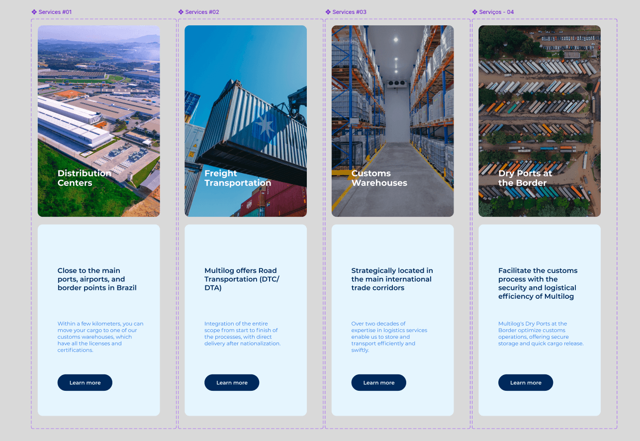
The prioritization matrix indicated three main pages. We prototyped these pages, tested them internally, validated with stakeholders, and iterated on important details before proceeding with the design of the homepage.
Healthcare Services
Chemistry and Hazardous Goods
Distribution Centers
We optimized some components through collaborative workshops with stakeholders, allowing us to understand business objectives and communicate them more effectively, understanding the iterations.
ITERATION #01
service cards
Captured images in Multilog's headquarter to generate the cover videos for our service cards. We optimized the hover interaction to deliver the description along with a CTA that directs the user to the capture page.
ITERATION #02
CUSTOMER-RELATED multi-step FORMS
We have summarized the main forms, but there are leads from specific segments that must provide us with extensive information to prove their qualification. We have reduced the pain of this journey with step-by-step forms developed according to each persona and desired service.
ITERATION #03
MULTILOG TIMELINE
The company's history is extensive and contains important expansion points that should be displayed. Previously shown on a single vertical scroll page, they are now integrated into an interactive timeline that presents information according to the brand's schedule.

ITERATION #04
navigation cards
At the end of specific pages, we offer navigation cards that provide exits for the user. We optimized these cards with our KPIs in mind, intending to direct the user to our sales team.
Reached the final stage of our project, where we prototyped all the pages of the website, tested them with a small group, and iterated again based on feedback from users and stakeholders.
Internal collaborators, logistics market partners, and occasional clients formed a group of 6 people who underwent interviews and guided interactions. The execution of the tasks brought us important optimizations.
MENU
When clicking on the header, the menu was covering the entire screen, making scrolling difficult on specific devices. We redesigned the dropdown and added an exit button for the user.
blog
Feeding the news is a challenging task; we created some excessive interactions that were not very important to the user. Removing them allowed us to create a page template in Salesforce that can be edited directly by the content manager.
feedbacks
The feedback cards were in a horizontal scroll gallery. Users would scroll through the gallery without seeing the other feedbacks. We added navigation arrows and set the second feedback to low opacity to make the interaction more intuitive.
BIG NUMBERS
A previous pain point was the difficulty in visualizing the company's scale. Multilog generates over R$ 1.3 billion and has 37 units in Latin America. Users did not perceive this at first glance. We increased the emphasis with bullet points of important numbers and motion icons.
The design system is online in a dedicated application. Additionally, we created documents in Figma Slides and PDF with detailed steps and guidelines that served as a foundation for the developers.
The development was carried out by Multilog's internal programming team, in conjunction with a third-party consulting.
We collaborated to understand the best way to optimize the files, participating in meetings and advocating in important parts of the process.